Microinteractions, halo effect, react-rewards. Reward your users for little things and make them smile!
Microinteractions? What is that!
Microinteractions are… let’s say they are events in our apps, that — when used wisely — create a moment of engagement and reward our users for the actions they performed. They are tiny design elements that are meant to be welcoming and memorable so that users remember them and subconsciously keep coming back to your app.
Microinteractions are meant to fulfill these main functions:
- Provide instant feedback or the result of an action to the user
- Enhance the sense of direct manipulation
- Communicate information about certain elements, like whether it’s interactive
- Help users see the results of their actions (also by evoking positive emotions)
- From the point of view of the app owner — they are meant to make users come back to your app
- They just make your site more emotional and human-ish
The “What is that!” part
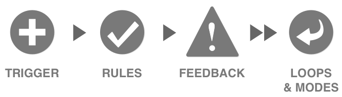 As stated by Dan Saffer, the author of the book Microinteractions, there are four main parts of microinteractions.
#1 Trigger
The trigger is what initiates an interaction. They can be user-initiated or system initiated.
- User-initiated trigger — the user initiates an action.
- System-initiated trigger — app detects that certain qualifications are met and initiates an action.
A good example of a system initiated trigger is that blue button that floats over twitter (saying that there are new tweets that you didn’t read) when you come back after some time (that’s the qualification that need to be met). It triggers you to click on it and scrolls you back to top of your feed.
#2 Rules
Rules are there to determine what should happen after a microinteraction is triggered. They should feel natural for a user, and they are made to help minimize errors. A great example is when you try to send an email through Gmail and you write “I’ve attached…” and you forget to attach a file. Gmail will tell you that “hey, you said that you will attach something and you didn’t! Would you like to send an email anyway?”.
#3 Feedback
It lets users know what’s going on, so that they don’t have to guess. A great example of a useful feedback is that green check mark that you often see when creating an account somewhere. When you type your username, the system should automatically tell if it’s free or used. There is literally nothing more frustrating than completing the whole form (especially a big one) and then having to come back because the username was already taken. Of course, for security reasons, you need to re-type your password and password confirmation… Ugh.
#4 Loops & Modes
Loops and modes are the answer to a “What happens to a microinteraction when conditions change?” question.
Microinteractions — a few examples
#1 Swipe gestures for navigation
Swiping is easier and more intuitive for users. It reminds of physically moving elements on the screen. It is also a way of limiting the necessity of thinking while user uses your app, and the less the average user has to think, the better experience they will get.
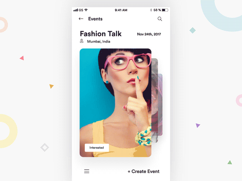 Source: Event cards iOS interaction by Divan Raj | Dribbble | Dribbble
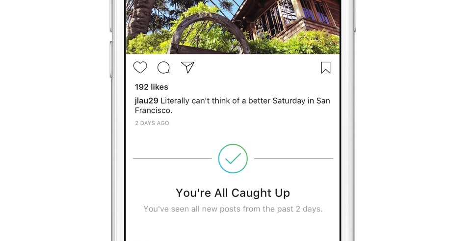
#2 Keeping users informed
Don’t let your user get bored. Keep them informed and (at least visually) engaged. Take a look at Instagram and their “You’re all caught up” banner. People at Instagram know that it is better to tell their users that they’ve already seen the rest of the photos below then let them get bored by scrolling through the same photos over and over again.
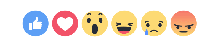
#3 Rewards
Reward your users for their actions. Have you ever heard of Facebook Text Delights? They are a great example of rewarding users. They are animations that trigger when you type specific phrases in the comment section. For example, try typing “you’re the best” or “wonderful time”.
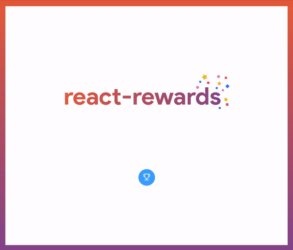
If you’re using React to create your app, you can use react-rewards, a small library I’ve created to let you reward your users with a rain of confetti or emoji!
Why should I care? I don’t have money for that!
The “why should I care?” part
(If you’re a girl, please replace “great girl” with “great boy” or leave it, it’s up to you.)
Imagine a situation where you’re sitting at the bar and see a great girl. She’s like… 11⁄10. Triple-cheese-double-bacon-jalapeno-burger out of 10, the best you can ever get. And you decide to take action. You come up with the best pick-up line this world ever heard of, and…
…and she lets you sit with her. Without any emotional feedback. Without a smile. Without showing you that you did great. Without the reward. You get what you wanted, she’s yours. But something is missing here — without the feedback you can only guess that everything went right. And let’s be honest…
It’s better to get the 9⁄10 that adores you, then 11⁄10 that just lets you sit with her. ~ develobear
The same applies to software. You can create an app that does what the users wants. Every single feature fits their needs, but eventually they will switch your app for another one that just feels more “human”. Although, if you design the microinteractions well, you can show your users a clear sign that you care about them. That’s why they value so much. If you provide an immediate visual feedback and teach a user to work with your system, they will come back to it. They won’t search for another app if they know how to use yours and if they are rewarded for what they do inside.
The “I don’t have money for that!” part
If you work in the IT industry and you don’t work for Google, Facebook, or any other huge corp that has lots of money, you probably encounter the we don’t have money for that from time to time. Maybe you got used to hearing it to the point where you don’t even think about things like microinteractions or animation, because you know that the budget is too small. I realize that with a small budget it is harder to think about things like that, but I need to introduce you to the so-called Halo Effect.
Halo Effect — use it wisely and users will be yours
The Halo Effect is a type of cognitive bias, where a person that likes or dislikes one aspect of a product, has a positive or negative predisposition towards the product in general. It is often based on the first impression. A simple example of the halo effect is when an individual noticing that the person in the photograph looks attractive, well groomed, and properly dressed, assumes that the person in the photograph is a good person.
Again, the same applies to software. Users will judge the whole app based on their first impressions, their first interactions with it, or even based on its design and fluidity. That’s why we need to make sure that we give them the best we can while they make their first taps or clicks through our app.
What does it have to do with microinteractions? It’s simple. You can invest in a well-designed microinteractions in the main part of your system, in the part that user interacts with immediately after opening your app. This way you will use the halo effect and create a great first impression that will make them subconsciously have a way better perception of your app in general. You don’t need to put microinteractions throughout your whole app. Start with the user onboarding process or registration if you’re short on the budget.
React-rewards — my way of easily rewarding users
If you’re short on the budget you can use a small React lib I’ve created, called react-rewards. It enables you to wrap your “register account” button with a confetti/emoji cannon in a few lines of code. This way you can easily reward your users for creating an account with a rain of confetti, or you can shoot a few coin emojis when the user clicks a donate button. Trust me, people will remember those tiny details. Visit my GitHub page to read more about it!
Hey, one more thing. I’ve created the graphics with the help of www.vecteezy.com