How to create a modern looking user interface? Get inspired by Memphis!
How to create a modern user interface? Get inspired by Memphis!
I won’t be writing about Memphis, Tennessee — neither about Memphis, Alabama; Memphis, Florida; Memphis, Indiana; Memphis, Michigan; Memphis, Mississippi; Memphis, Missouri; Memphis, Nebraska; Memphis, New York; Memphis, Ohio; Memphis, Texas; Memph…
Of course, you can get inspired by these cities. You can even search for inspiration in Memphis, Egypt, which was the ancient capital of Lower Egypt. I mean… you could search for inspiration there, if not the fact that it existed 5000 years ago 😛 Nonetheless I will try to get you inspired by something that started not that long ago — Memphis Design, which has nothing to do with all the above cities — it has its origins in Milan, Italy. 🇮🇹
The movement
The movement itself was created in 1981 by Ettore Sottsass — an Italian architect and designer. Sottsass organized a meeting with other designers after which they officially formed a design collaborative named Memphis. It was a protest against Mid-century modern architectural style and 1970s minimalism. Both styles were about clean simplicity. Memphis Group designers decided to stand against this movement — they started designing using various geometric shapes from Art Déco style, combined with bold and vivid colors derived from Pop Art.
The story behind this name seems quite mysterious, considering the fact that the meeting took place in Milan but it actually isn’t that surprising — the name was taken after Bob Dylan’s song ”Stuck Inside of Mobile with the Memphis Blues Again”. The song had been played repeatedly throughout their first meeting. 🎸
It looks bizarre, unconventional, maybe even irrational but at the same time, it is quite appealing. You could probably go insane while spending too much time in these rooms though 🤯
There are lots of designs I could show you, from furniture, interiors, mobile apps, through landing pages, to whole web apps. Instead, I will try to show you the main points you should focus on when creating your own designs.
How to create a Memphis looking user interface?
1. Use Sesame Street colors
 Maybe you don’t need to use the colors from Sesame Street itself… but you certainly can search for inspirations there. You can also use a website I tend to use a lot when designing things — Flat UI Colors. No matter if you’re a designer, front-end developer, or just a guy/girl who came here because there was a bear in the title — you should use color palettes. There is something about them — they just work together nicely. 🎨
View this post on Instagramby Shafiqul Islam Follow us @welovewebdesign - Link: https://dribbble.com/shots/4257826 - More daily inspiration? @welovebranding @weloveillustration @weloveanimations
2. Use diverse, multi-colored objects — reject typical shapes
Looking at webarchive it is quite hard to find a website created, let’s say 10 years ago, that would use triangles, hexagons, circles or blobs in its design. Nowadays we often see different shapes on websites and we should use them — they make our designs less clichéd.
View this post on Instagramby Dragon Lee Follow us @welovewebdesign - Link: https://dribbble.com/shots/4965942 - More daily inspiration? @welovebranding @weloveillustration @weloveanimations
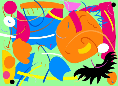
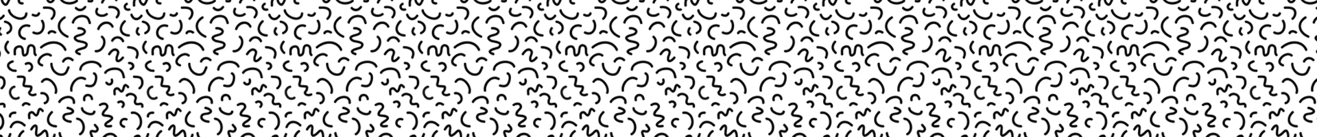
3. Use Squiggles and Zig-Zags
The word itself is quite funny, but Squiggles — aka the Bacterio print, was designed by Sottsass in 1978 and it is Memphis’s trademark pattern.
4. Use Shaquille O’Neal-bold fonts
Combining huge, bold fonts with delicate, thin ones always worked great. In fact, I do it in almost every project I create. It just works together and it can be easily fitted into a Memphis Design app. Use 900 font-weight for titles and 200 for paragraphs.
View this post on Instagramby Vladimir Biondic @vladimirbiondic Follow us @welovewebdesign - Link: https://dribbble.com/shots/4214289 - More daily inspiration? @welovebranding @weloveillustration @weloveanimations
5. Gradients are back in style, baby!
All right, this one wasn’t a part of Memphis Design. As far as I know, they didn’t use gradients back then. Nonetheless, I decided to include gradients because they look gorgeous in combination with previous mentioned designs. I often use UI Gradients as a source of inspiration – they have some of the most beautiful gradients out there.
View this post on Instagramby Eddie Lobanovskiy @lobanovskiy Follow us @welovewebdesign - Link: https://dribbble.com/shots/5367995 - More daily inspiration? @welovebranding @weloveillustration @weloveanimations
JKJK, but if you really want to be cool, you can even get a gradient on your head.
User Interfaces
Memphis Design is often found in user interfaces. In fact, it is probably the best way to go with your next project. You could not know the name, you don’t even have to, but I’m sure you’ve seen it before — most likely in modern mobile, web or magazine designs.
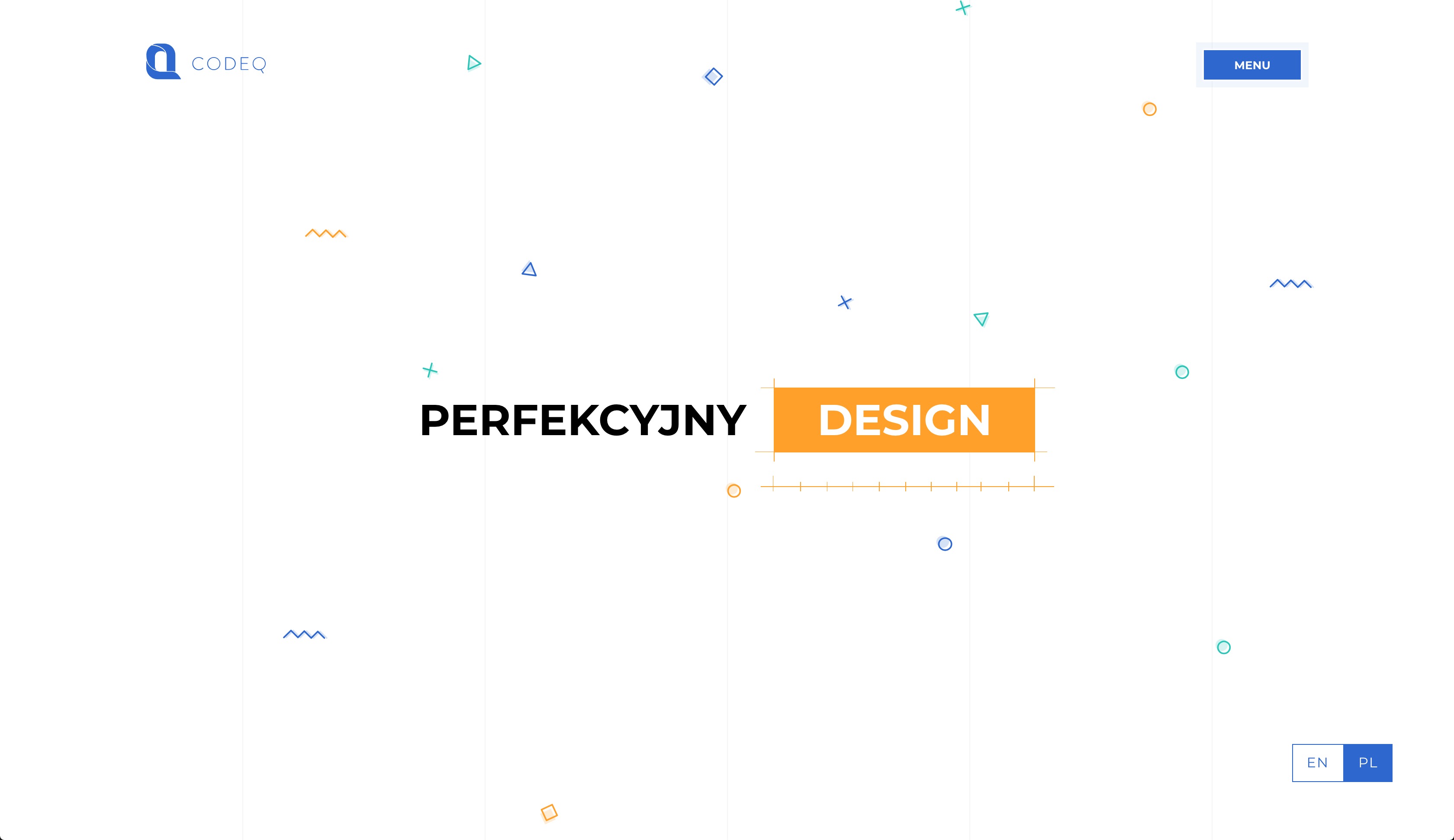
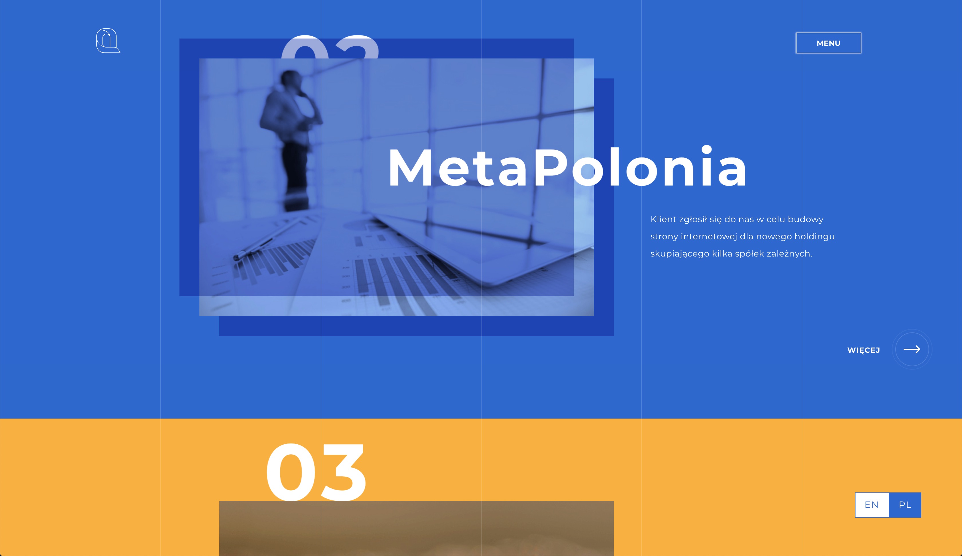
If there is something I can be sure about, it is that if you want to find the best up-to-date designs you should probably visit awwwards.com or Pinterest. I can’t stress enough how much inspiration you can get from there. I didn’t even have to search for a Memphis Design website, I just visited the main page and hey, there it is! It was created by Codeq company from Poland.
(BTW, I’m not sponsored by anyone but if this post gets hundreds of thousands of reads I wouldn’t mind being. 😅)
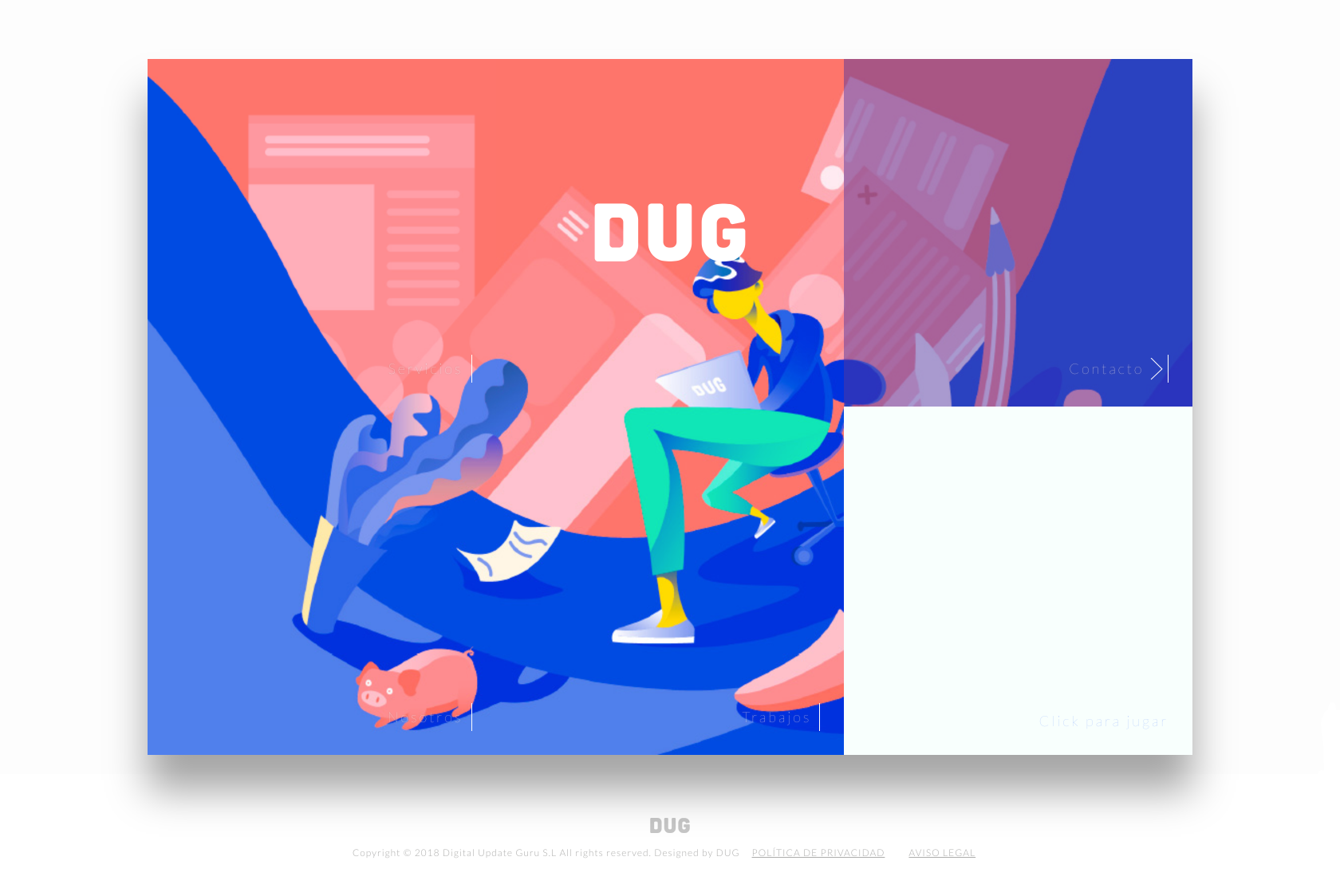
Other examples are from Dug company and welovewebdesign instagram account.
View this post on Instagramby Sudhan Gowtham Follow us @welovewebdesign - Link: https://dribbble.com/shots/4747268 - More daily inspiration? @welovebranding @weloveillustration @weloveanimations
Those designs have a lot in common with the Memphis movement work. I am aware that it is not exactly what Memphis movement was all about, though. Nowadays those designs are not a reaction against trends. Nowadays they are an example of how a movement, that half a century ago would’ve seemed absurd, is now back in vogue. Those designs are full of vivid colors and different shapes, but they try to stay minimalistic and clean at the same time. I have to say I’m a big fan of this combination.
TL;DR
If you want your next project to look “Memphisy” and draw people’s attention you should:
- Use bright, bold colors – aka Sesame Street Colors. Make use of color-palettes. That way you will be sure that the colors you choose will match eachother.
- Use diverse shapes – triangles, hexagons, blobs. Don’t limit yourself to just rectangular sections. Create shapes that overlap, be brave with your designs.
- Use Squiggles and Zig-Zags. Squiggles and zig-zags are a big part of Memphis Design, you can try to use them in backgrounds or images, they will add a nice touch.
- Create titles and H1’s with bold fonts. I mean Shquille O’neal-bold fonts. Make them big. Use 900 font-weight for titles and 200 for paragraphs.
- Gradients are back in style, baby! I know that people were afraid of gradients before. Fortunately they are back in style. Maybe they are not what Memphis Design was all about, but they fit nicely in there.
Summary
Trends, especially the design ones, are cyclical. They tend to repeat themselves every few decades. We can notice it in interior designs, fashion, or in music. It seems that even the most bizarre and outrageous trends are able to find their way of coming back in vogue. The Memphis Design Movement is no different. After a journey that started as a relatively brief experimental movement within furniture design, the Memphis Design trend has got into patterns, mobile, and web design.
Hey, one more thing. I’ve created the graphics with the help of www.vecteezy.com